The key to a successful digital transition is not replicating your traditional tools, but translating your unique artistic DNA.
- Your digital work feels lifeless because it lacks the « engineered imperfection » and texture that defines traditional media.
- Professional digital artists use a strategic mindset, translating the *intent* behind their marks rather than just copying the look.
Recommendation: Stop trying to make your tablet feel exactly like paper. Instead, start by identifying the core elements of your style and find new, digital-native ways to express them.
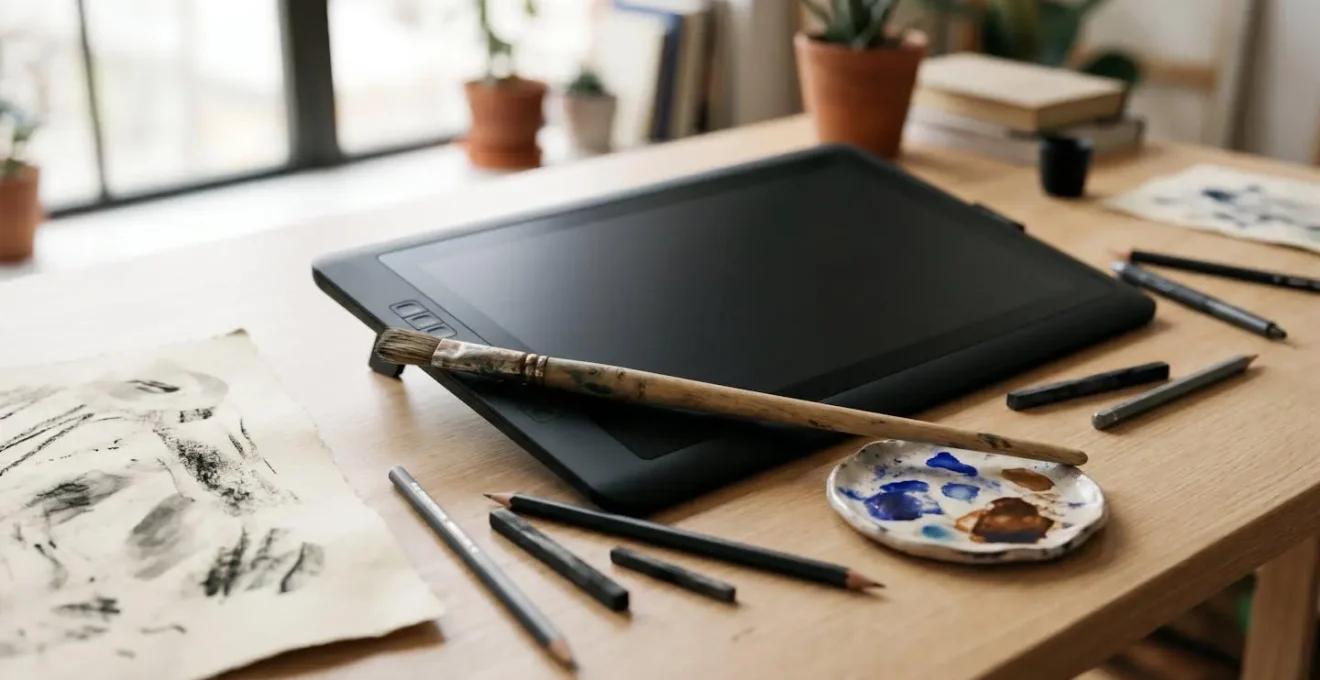
The first time a traditionally trained artist opens a digital canvas, the experience can be deeply disheartening. The lines feel slick and sterile, the colours flat, and the final piece often lacks the very soul that defines their physical work. There’s a tangible disconnect between the artist’s hand and the screen, a frustrating void where texture, happy accidents, and personality used to live. You have spent years honing a specific feel, a unique mark, only to see it vanish on the pristine, unforgiving surface of a tablet.
Conventional wisdom offers quick fixes: « get a better tablet, » « download these paper-texture brushes, » or « just learn the software. » While technically useful, this advice misses the fundamental issue. The problem isn’t a lack of the right tools; it’s the absence of the right mindset. The challenge isn’t about perfectly replicating the resistance of a 2B pencil on cold-press paper. It’s about understanding your unique artistic DNA and learning how to translate it into a new digital language.
This guide is built on a different premise. Instead of chasing a perfect 1:1 copy of your traditional workflow, you will learn to become a translator. You will deconstruct what makes your style yours—your line quality, your colour choices, your signature imperfections—and then rebuild it strategically in the digital realm. This isn’t about losing your identity; it’s about giving it a powerful new voice.
This article provides a complete roadmap for this transition. We’ll explore everything from the technical setup that bridges the physical-digital gap to the strategic thinking that separates amateur digital artists from seasoned professionals, all aimed at helping you develop a signature aesthetic that is both digital-native and authentically yours.
Summary: Mastering Digital Art While Keeping Your Traditional Soul
- Why Your Digital Illustrations Feel Lifeless: The Texture Problem Traditional Artists Face
- How to Set Up Your Drawing Tablet to Mimic the Resistance of Traditional Media?
- Procreate vs Adobe Creative Cloud: Which Digital Illustration Platform for UK Freelancers?
- The Layer Effect Trap That Makes Professional Illustrators Instantly Spot Beginners
- When to Work at 300 DPI vs 150 DPI: File Size Management for Digital Illustrators?
- Why Your Work Looks Like Everyone Else’s: The 5 Missing Elements of Signature Style
- Free Editing Tools vs Adobe Suite: At What Skill Level Does the £50 Monthly Subscription Pay Off?
- How to Develop a Signature Aesthetic That Makes Your Work Instantly Recognisable?
Why Your Digital Illustrations Feel Lifeless: The The Texture Problem Traditional Artists Face
The single biggest hurdle for traditional artists moving to digital is the « texture problem. » In the physical world, texture is a given. It’s the grain of the paper, the drag of charcoal, the unpredictable bleed of watercolour. These « imperfections » are not flaws; they are the-handwriting of the medium, infusing the work with life and a sense of human touch. Digital canvases, by default, are perfectly smooth, perfectly predictable, and consequently, feel sterile. This isn’t just an aesthetic preference; it’s a fundamental disconnect, reflected in the fact that only 24% of art teachers list digital art as the medium they’re most comfortable with, according to a 2024 survey. The struggle is real and widespread.
This lack of inherent texture forces a major mindset shift. You can no longer rely on the medium to provide character; you must actively engineer it. This means moving beyond simple « paper overlay » filters and thinking like a digital native. How can you use layers, blend modes, and custom brushes not to fake paper, but to create a new, unique textural language that serves your art? The goal is not replication but translation.
The market is validating this search for authenticity. As Keli Hogsett, founder of CoCollect, noted in a recent analysis, the art world is seeing a resurgence of interest in tactility. She states that artworks with deep texture are trending because they communicate originality and humanity in a way that smooth, perfect screens often cannot. For the traditional artist, this is an opportunity. Your ingrained understanding of texture is not a liability in the digital world; it’s your greatest asset, waiting to be unlocked.
Ultimately, embracing the digital canvas means becoming a conscious creator of texture, not a passive recipient of it. It’s about embedding your « human-made » signature into the pixels themselves.
How to Set Up Your Drawing Tablet to Mimic the Resistance of Traditional Media?
While the ultimate goal is to translate your mindset, not just your tools, calibrating your hardware is a crucial first step in bridging the gap. The feeling of « uncontrollable slickness » on a new tablet often comes from a mismatch between your muscle memory and the default pressure sensitivity. Customizing your tablet’s pressure curve is the single most effective technical tweak to make the digital feel more natural and responsive to your hand.
Think of the pressure curve as the transmission of your artistic intent. A default, linear curve means pressure is registered evenly. But traditional tools are not even. A soft charcoal stick yields dark marks with very little pressure, while an ink pen requires force for a bold line. By adjusting the curve, you can teach the software to respond in a way that feels familiar to your specific traditional style.
- Soft Curve (Charcoal/Pastel Feel): An upward-bending curve makes the brush highly sensitive at low pressure. It’s ideal for expressive, sketchy work where you want to achieve full opacity quickly.
- Hard Curve (Ink Pen/Pencil Feel): A downward-bending curve provides more control in the lighter pressure ranges, requiring more force to reach 100% opacity. This is perfect for precise, controlled linework.
- S-Curve (Dynamic Feel): A slight « S » shape can give you enhanced control at both the very light and very heavy ends of the pressure spectrum, offering a dynamic range for varied mark-making.
The key is to experiment. Spend 30 minutes drawing simple pressure strokes—from barely touching the surface to a full-force press—and adjust the curve until the output on the screen matches the intent in your mind. This is your first act of translating your physical touch into a digital command.
Procreate vs Adobe Creative Cloud: Which Digital Illustration Platform for UK Freelancers?
Choosing your primary software is a major decision, especially for a freelancer where time is money and workflow efficiency is paramount. In the UK market, the debate often boils down to two titans: Procreate and Adobe Creative Cloud. The choice isn’t about which is « better, » but which is strategically right for your business model and client base.
Procreate, with its one-time purchase fee, is incredibly appealing to independent artists and those just starting out. Its intuitive interface is designed from the ground up for the iPad, offering a seamless, focused drawing experience. If your work primarily involves creating final illustrations directly for clients or for your own portfolio, Procreate offers a powerful, professional-grade studio at an unbeatable price point. It excels at raster-based painting and drawing.
Adobe Creative Cloud, on the other hand, is the industry-standard ecosystem. The monthly subscription is a significant commitment, but it buys you unparalleled integration. If you work with agencies, design teams, or in pipelines that involve animation or print layout, the ability to move assets effortlessly between Photoshop, Illustrator, Fresco, and InDesign is a non-negotiable advantage. Shared Cloud Libraries, vector capabilities in Illustrator, and advanced photo-manipulation tools in Photoshop are what you’re paying for. As a freelancer, this becomes a critical consideration when a client demands a layered .PSD file or native .AI vector assets.
The following table breaks down the key considerations for a UK-based freelance illustrator, based on an analysis of their core features.
| Criteria | Procreate | Adobe Creative Cloud |
|---|---|---|
| Pricing Model | One-time purchase (£12.99 / $12.99) | Subscription: £21.98/month individual, £27.99/month business |
| Platform Availability | iPad only | iPad, Windows, Mac desktop |
| Best For | Independent artists, beginners, portfolio building, direct-to-client work | Agency collaboration, complex print jobs, teams using InDesign/After Effects |
| Workflow Integration | Standalone; exports to PSD, PNG, JPEG with extra steps | Seamless integration across Photoshop, Illustrator, InDesign; shared Creative Cloud libraries |
| Brush Capabilities | Massive custom brush library, raster-based | Vector, raster, and live brushes (Fresco); advanced brush engines (Photoshop) |
| Portability | Exceptional—professional studio on iPad | Cloud sync across devices; accessible from multiple locations |
| Learning Curve | Intuitive, beginner-friendly | Steeper; requires familiarity with Adobe ecosystem |
Many professionals end up using both: Procreate for initial sketching and painting on the go, and Adobe for final polishing, vector work, and client delivery. Your choice should be dictated by your clients, your workflow, and your budget, not by online arguments of superiority.
The Layer Effect Trap That Makes Professional Illustrators Instantly Spot Beginners
In digital illustration, nothing separates a beginner from a professional more clearly than their use of layers. For newcomers, layers are often just a way to separate the character from the background. For a pro, layers are a strategic, non-destructive playground for experimentation, control, and efficiency. The « layer trap » is falling into a chaotic mess of dozens of unnamed « Layer 1, » « Layer 2 copy, » etc. This isn’t just messy; it’s a symptom of a reactive, rather than proactive, workflow.
A professional layer strategy is built on three pillars: naming, grouping, and non-destructive editing. It’s a system you establish at the beginning of a project, not something you clean up at the end. This methodical approach allows you to make radical changes—altering colours, adjusting compositions, re-posing elements—deep into the creative process without having to redraw everything from scratch. It’s the digital equivalent of an animator’s cel setup, giving you maximum flexibility.
Adopting a professional layer workflow is a direct translation of a traditional artist’s methodical process (e.g., underpainting, glazing) into the digital space. It requires discipline, but the payoff in saved time and reduced frustration is immense, especially when dealing with client revisions. Below is a checklist to audit and professionalize your own layer management habits.
Action Plan: Professional Layer Management Audit
- Descriptive Naming: Immediately replace generic names like ‘Layer 1’ with clear descriptions such as ‘Character Linework’, ‘Background Trees’, or ‘Foreground Shadow’.
- Grouping and Folders: Organize related layers into collapsible groups. Create folders for major illustration elements like ‘Character’, ‘Background’, and ‘FX’.
- Color-Coding: Assign consistent color labels to layer types (e.g., red for linework, blue for flats, yellow for lighting) to quickly identify categories visually.
- Avoid ‘Layer Monoculture’: Establish your naming and grouping conventions from the start of a project to prevent the buildup of dozens of unidentified layers.
- Practice Non-Destructive Efficiency: Use Smart Objects for placed art and Adjustment Layers for color/tonal changes. This maintains maximum flexibility for revisions instead of « baking in » your changes by flattening layers too early.
Mastering this system is a core component of translating your artistic identity. It’s what allows you to experiment, take risks, and « find » the image digitally, just as you would on a physical canvas, but with the incredible power of an undo button.
When to Work at 300 DPI vs 150 DPI: File Size Management for Digital Illustrators?
The concepts of resolution, DPI (Dots Per Inch), and file size are often a source of immense confusion for artists transitioning to digital. The fear of creating a « low-res » image can lead to bloated, sluggish files, while misunderstanding the requirements can result in pixelated final products. The key is to understand that resolution strategy isn’t a single choice, but a workflow.
First, let’s clarify the terms. Pixel dimensions (e.g., 4000px by 6000px) are the true measure of your image’s data and detail. DPI is a print instruction; it tells a printer how many of those pixels to squeeze into a physical inch of paper. A 3000px wide image printed at 300 DPI will be 10 inches wide. The same image printed at 150 DPI will be 20 inches wide, but will look more pixelated up close. For web and screen use, DPI is largely irrelevant; only pixel dimensions matter (e.g., a 1920px wide image for a standard HD screen).
The standard advice is « 300 DPI for print, 72/150 DPI for web. » While correct, professionals employ a more nuanced approach to balance quality with performance.
Case Study: The Professional’s Two-Tier Resolution Strategy
Experienced digital illustrators often adopt a two-tier resolution strategy to maximize both creative flexibility and system performance. They begin their work on a large canvas at a high resolution, often 400-600 DPI. This « working file » provides several advantages: it captures the finest details of custom brushes, allows for significant cropping or resizing without losing quality, and provides a safety margin for unexpected client requests for larger print sizes. However, working consistently at this high resolution can slow down the computer, especially with many layers.
The second tier is the « delivery file. » Once the illustration is complete, the artist saves a copy and downsamples it to the required output specifications. This means resampling the image to 300 DPI for a standard print job or 150 DPI (and appropriate pixel dimensions) for web use. Critically, professionals maintain a structured archive, saving the full-resolution, layered master file (as a .PSD or .TIFF) separately from the flattened, compressed delivery file (like a .JPG or .PNG). This ensures they can always go back to the original high-quality source for future edits, portfolio use, or different output formats.
This strategy frees you to create with the highest quality possible without being constantly bogged down by performance issues, ensuring your final output is perfectly optimized for its intended purpose.
Why Your Work Looks Like Everyone Else’s: The 5 Missing Elements of Signature Style
When you first start working digitally, it’s easy to fall into the trap of « tool-based » style. You download a popular artist’s brush pack, follow their tutorials, and end up with work that looks… a lot like theirs. This happens because the inherent personality of traditional media is gone, and you haven’t yet learned to inject your own. A signature style isn’t about having a unique brush; it’s about making consistent, conscious choices across every aspect of your work. Your « artistic DNA » is a combination of five key elements.
If your digital work feels generic, it’s likely because one or more of these elements is underdeveloped or inconsistent.
- A Cohesive Color Palette: Do you have a go-to color philosophy? Are you known for muted, earthy tones, or vibrant, clashing neons? A signature style has a recognizable color harmony.
- Deliberate Mark-Making: This is the quality of your lines and shapes. Are they clean and graphic, or sketchy and organic? This is a direct translation of your physical « hand. »
- Recurring Subject Matter or Motifs: What do you love to draw? Robots, botanicals, melancholic portraits? A consistent theme creates a recognizable world for your viewers.
- Consistent Compositional Rules: Do you favor centered, symmetrical compositions, or dynamic, off-kilter arrangements? Your approach to structuring an image is a style signature.
- An ‘Error’ Signature: What are your beautiful mistakes? The wobbly lines, the paint bleeds, the grainy textures in your traditional work. Learning to engineer these « errors » digitally is the final step in reclaiming your identity.
The digital art market is booming, and this presents a huge opportunity for artists who can stand out. The overall market, valued at over $5 billion, is projected to triple, with digital paintings accounting for over 25% of this market. This growth reflects a growing demand for unique voices who have mastered the medium.
As digital artist Tamara Osborn states, audiences are shifting away from generic perfection: « I believe artists will lean to individualism… Audiences are losing their appetite for perfect lighting and smoothness—this technique is being used to produce a look that evokes a sense of the hand-drawn and the human-made. » Your unique combination of these five elements is how you answer that call.
Free Editing Tools vs Adobe Suite: At What Skill Level Does the £50 Monthly Subscription Pay Off?
For any freelance illustrator, the jump from free or low-cost software to a full Adobe Creative Cloud subscription is a significant financial and professional milestone. The question isn’t just about features; it’s about return on investment (ROI). At what point does the steep monthly fee stop being a cost and start becoming a profit-driver? The answer lies at the intersection of efficiency, client demands, and professional workflow.
Free and one-time purchase tools like Procreate, Krita, or the Affinity suite are incredibly powerful. You can build a stunning portfolio and serve many clients without ever touching an Adobe product. The turning point often comes when the time saved by premium features outweighs the cost of the subscription. For example, if a single use of Photoshop’s Content-Aware Fill or an advanced Puppet Warp saves you an hour of tedious redrawing, the subscription starts to justify itself very quickly.
However, the most critical factor is often external. The moment a high-value client requires a deliverable you can’t easily produce—like a layered .PSD for an animation studio or access to a shared team library—the subscription becomes non-negotiable. This is the « Client Mandate » trigger.
Case Study: The UK Freelancer’s Adobe ROI Calculation
Let’s consider the math for a UK freelancer. According to a detailed breakdown of freelance tool value, the investment calculus is straightforward. For an illustrator charging a modest £25/hour, the £50/month Adobe subscription pays for itself if its exclusive features save them just two hours of work per month. The real value is unlocked when a freelancer’s workflow leverages multiple apps within the suite—for instance, managing references in Lightroom, painting in Photoshop, creating vector assets in Illustrator, and laying out a portfolio in InDesign. This cross-app synergy is something standalone apps cannot replicate. The ultimate trigger, however, remains the ‘Client Mandate’: the first time an agency requires access to a shared Creative Cloud library or a native, layered file for their own pipeline, the subscription transitions from a ‘nice-to-have’ to an essential cost of doing business at a professional level.
Ultimately, the Adobe suite is an investment in removing friction and opening doors to higher-tier client work. The right time to invest is when the friction of *not* having it costs you more in time or lost opportunities than the subscription fee itself.
Key Takeaways
- Translate, Don’t Replicate: The goal is to translate the *intent* and *feeling* of your traditional style, not to create a perfect digital copy.
- Engineer Your Imperfections: Digital sterility is a blank slate. You must consciously re-introduce the textures, wobbly lines, and « happy accidents » that define your human touch.
- Strategy Over Tools: A signature style comes from a consistent strategy in color, composition, and mark-making—not from a specific brush pack or software.
How to Develop a Signature Aesthetic That Makes Your Work Instantly Recognisable?
Developing a signature aesthetic is the final frontier in your digital transition. It’s the culmination of all the previous steps: a calibrated tablet, a chosen software, a professional layer strategy, and an understanding of your artistic DNA. This is where you move from being a competent digital artist to being an *author*, whose work is instantly recognizable. This doesn’t happen by accident; it’s the result of deliberate practice and strategic constraints.
The paradox of digital art is its infinite choice. With millions of colours and endless brushes, it’s easy to get lost and for each piece to feel disconnected from the last. The fastest way to develop a style is to intentionally limit your options. By forcing yourself to work within a defined set of rules, you build the consistency and repetition that are the hallmarks of a signature look. This is not about stifling creativity, but channeling it.
The « Style Trinity » framework is a powerful exercise for this purpose. It forces you to define and then execute on the core pillars of your style.
- Define Your Style Trinity: First, analyze your traditional work. What is the intersection of your (1) Subject (what you draw), (2) Technique (how you draw it), and (3) Concept (why you draw it)? Write these down. This is your artistic mission statement.
- Create Your Constraint Set: For your next three illustrations, create a strict ruleset based on your Trinity. For example: use only five specific colours, two custom brushes you’ve made, and one texture overlay.
- Execute the 3-Project Series: Complete three separate illustrations using *only* your defined constraints. No cheating. This focused repetition will rapidly accelerate your stylistic development.
- Analyze Your ‘Error Signature’: Study the beautiful imperfections in your traditional work—the way a line wobbles, how paint bleeds. Now, try to engineer digital equivalents using liquify filters, custom smudge brushes, or « chaos layers » to embed your unique mark-making DNA.
This process of building a hybrid style—one that combines the organic textures of traditional art with the impossible vibrancy and effects of digital—is what the modern art market craves. As evidence, Art Basel 2024 data shows that 68% of millennial collectors prefer art they can physically touch and display, highlighting a deep-seated desire for tactile, human qualities, even in an increasingly digital world. Your ability to evoke that feeling digitally is your unique value proposition.
Begin this process today. Define your constraints, execute your series, and start building a body of work that is not just digitally proficient, but authentically, unmistakably you.