Many home cooks follow established plating ‘rules’ yet feel their dishes lack a certain soul. This guide reveals that the secret isn’t more rules, but cultivating compositional intent. This is a holistic approach where every choice—from the plate itself to the final garnish—is a conscious decision made to amplify flavour, tell a story, and create a truly satisfying emotional experience for both the cook and the diner.
You’ve spent hours perfecting a recipe. The flavours are balanced, the textures are a delight, and the aroma filling your kitchen is intoxicating. But when it comes to transferring your culinary creation from the pan to the plate, a familiar sense of uncertainty creeps in. Does the final presentation truly honour the effort and taste of the dish? For many intermediate and advanced home cooks, this is the final hurdle—the gap between a delicious meal and an unforgettable dining experience.
The internet is filled with common advice: use the rule of thirds, arrange in odd numbers, use contrasting colours. While these tips are a decent starting point, they often lead to technically correct but emotionally sterile plates. They teach the “what” but completely miss the “why.” This can leave you feeling more like a technician following a diagram than an artist expressing a vision. The true craft of plating is not about rigidly adhering to a checklist; it’s about understanding the principles of design and psychology to create a cohesive, intentional, and satisfying sensory narrative.
This guide moves beyond the platitudes. We will explore the concept of compositional intent, treating the plate as a canvas and your ingredients as a medium. We’ll delve into the science of how visual beauty genuinely makes food taste better, dissect the visual grammar that separates amateur from professional presentation, and provide practical frameworks for choosing the right elements. The goal is to empower you to develop a personal plating aesthetic that feels authentic, enhances flavour, and, most importantly, brings a deep sense of joy and satisfaction to the act of serving.
This comprehensive guide will walk you through every aspect of dish composition, from foundational design principles to developing your unique artistic voice. Explore the topics below to transform your plates from simple meals into celebrated experiences.
Summary: The Art of Plating: A Guide to Beautiful & Flavourful Dish Composition
- How to Balance All Visual Elements on a Plate So Nothing Feels Accidental?
- The Difference Between Meaningful Garnishes and Pointless Decoration on a Well-Plated Dish?
- How to Choose the Right Plate Shape, Size and Colour to Enhance Rather Than Fight Your Food?
- When Does “Well-Plated” Cross the Line Into Pretentious or Unapproachable?
- How to Evolve a Personal Plating Aesthetic That Feels Like “You” While Remaining Versatile?
- Why Beautifully Plated Food Actually Tastes Better: The Science and Psychology?
- Why Hierarchy, Contrast and Alignment Transform Amateur Designs into Professional-Looking Work?
- How to Master Artistic Plating at Home That Enhances Flavour Perception and Dining Pleasure Without Stress?
How to Balance All Visual Elements on a Plate So Nothing Feels Accidental?
The feeling of a plate where every element belongs is not magic; it is the result of deliberate visual balance. The goal is to guide the diner’s eye across the dish in a way that feels natural and intentional. One of the most effective tools borrowed from art and photography is the rule of thirds. Instead of defaulting to placing your main component in the dead centre of the plate, you create a more dynamic and engaging composition by placing it slightly off-centre. This simple shift forces the eye to move and explore the rest of the plate, taking in the supporting elements.
To apply this, imagine your plate is divided by a tic-tac-toe grid. The four points where the lines intersect are your power-points—the most visually compelling spots to place your focal element, usually the protein. From there, you can arrange the other components, such as carbohydrates and vegetables, in the remaining sections. Think of the rim of the plate as a picture frame and the empty, or “negative,” space as a crucial element in its own right. This strategic use of white space prevents the plate from feeling cluttered and helps to highlight your beautiful ingredients, making the entire composition feel considered and professional.
This balance isn’t just about placement; it’s about visual weight. A dense, dark piece of braised meat carries more visual weight than a light, airy foam or a delicate sauce. You can achieve a harmonious balance by counteracting a “heavy” element with several “lighter” ones. Use swirls of sauce or a scattering of herbs to create lines that create a sense of flow, leading the eye naturally towards the star of the dish. This creates a dynamic tension that is far more interesting than perfect, rigid symmetry.
By thinking like a composer arranging notes, you transform a collection of ingredients into a cohesive and visually pleasing symphony.
The Difference Between Meaningful Garnishes and Pointless Decoration on a Well-Plated Dish?
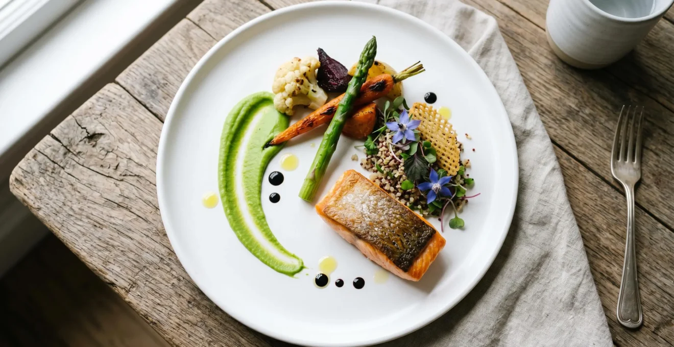
A garnish can be the element that elevates a dish from great to sublime, or it can be a distracting afterthought. The critical distinction lies in its purpose. A meaningless decoration is something added for colour or flair that has no relationship to the flavours of the dish—it is purely ornamental. A meaningful garnish, however, is an integral part of the sensory narrative. It must pass the “edibility test”: would you want to eat it in the same bite as the main component?
If the answer is yes, that garnish is likely functional. A functional garnish serves a specific purpose that enhances the dining experience. It might be a “flavour echo,” where a sprig of the same herb used in the sauce reinforces the primary aroma. It could provide textural contrast—the crunch of a toasted seed on a smooth purée, or the sharp bite of a pickled shallot against rich, fatty meat. It can also introduce a new aromatic layer, like the bright scent of fresh citrus zest grated over a piece of fish just before serving. These are not decorations; they are essential supporting actors.
Case Study: The Evolution from Kale-and-Orange to Functional Garnishing
In the past, it was common for chefs to throw a piece of kale and an orange slice onto every plate as a default garnish. These elements added a splash of colour but contributed nothing to the dish itself, and were rarely eaten. Modern culinary philosophy has shifted dramatically towards functional, purposeful garnishing. The focus is now on meticulously selecting elements that pair harmoniously with the meal, with the ultimate goal being to create that “perfect bite” where all flavours and textures converge. This represents a fundamental change from decoration for its own sake to creating flavour-enhancing elements that serve a clear purpose, whether through flavour echo, textural contrast, or aromatic introduction.
The image below perfectly illustrates this principle. Notice how the fresh herbs are not just scattered but deliberately placed to add texture, fragrance, and a visual clue to the flavours within the dish. Each element has earned its place on the plate.
Ultimately, a meaningful garnish feels indispensable. If you were to remove it, the dish would feel slightly less complete. It’s the final brushstroke that ties the entire composition together, proving that the most beautiful elements are often the most functional.
Before adding any garnish, ask yourself a simple question: “What is its purpose?” If you have a clear answer that relates to flavour, texture, or aroma, you are on the right track.
How to Choose the Right Plate Shape, Size and Colour to Enhance Rather Than Fight Your Food?
The plate is not a mere vessel; it is the canvas upon which your culinary art is presented. The shape, size, and colour of your dishware have a profound, often subconscious, impact on how food is perceived. As trivial as it may seem, these choices are a foundational element of compositional intent. In fact, research demonstrates that these characteristics are far from neutral, with a 2024 study revealing plate size (from 24-31cm), shape, and color had a significant effect on how diners perceived a dish.
The size of the plate dictates the use of negative space. A larger plate with a smaller portion in the center can feel luxurious and refined, drawing focus to the food. A smaller, fuller plate can evoke feelings of comfort, abundance, and rusticity. The shape also tells a story: round plates are classic and harmonious, square or rectangular plates feel modern and bold, and organic, irregular shapes can lend an earthy, artisanal feel. The key is to match the plate’s character to the food’s personality. A delicate seafood crudo might feel lost on a heavy, dark stoneware plate but would sing on light, white porcelain.
Colour is perhaps the most powerful tool in your plating arsenal. White is the classic choice for fine dining because it provides a blank canvas that makes colours pop and creates high contrast. However, other colours can be used strategically to influence flavour perception and mood. A dark or black plate can make colourful ingredients appear more vibrant and often enhances the perception of savoury notes. Earthy tones like slate grey or brown can make rustic dishes feel more authentic and comforting.
The following table, based on principles of plate psychology, breaks down how different plate colours can be used to manipulate perception and enhance your culinary creations. As you can see from this insightful analysis on plate psychology, every choice communicates something.
| Plate Color | Psychological Effect | Best Used For | Perception Impact |
|---|---|---|---|
| White | Creates high contrast, enhances perceived sweetness | Fine dining, delicate dishes, colorful foods | Makes food taste sweeter and more refined; serves as blank canvas |
| Black | Creates sophisticated, modern atmosphere | Colorful ingredients, artistic presentations | Enhances savory flavors; desserts rated higher on black vs white plates |
| Red | Stimulates appetite, creates warmth | Hearty, comfort foods | Can make food appear sweeter; creates visual pop with green salads |
| Slate Gray/Dark Stoneware | Creates earthy, comforting feel | Rustic dishes, comfort food, farm-to-table concepts | Makes food feel more authentic and grounded |
| Light Blue/White Porcelain | Signals freshness, delicacy, precision | Seafood, light dishes, Japanese cuisine | Enhances perception of freshness and quality |
By selecting your dishware with the same care you take with your ingredients, you add another layer of intentionality and storytelling to your final presentation.
When Does “Well-Plated” Cross the Line Into Pretentious or Unapproachable?
In the passionate pursuit of beautiful plating, it is possible to go too far. The line between “well-plated” and “pretentious” is crossed when the presentation stops serving the food and the diner, and starts serving the cook’s ego. Pretentious plating is often characterized by unnecessary complexity, where techniques are used for show rather than for function. Think of microscopic dots of sauce that are impossible to taste, garnishes so delicate they disintegrate on contact, or arrangements so architectural that the diner is afraid to disturb them.
A well-plated dish invites you to eat it; a pretentious one can feel like a museum piece under a “Do Not Touch” sign. The experience becomes about admiring the cook’s technical skill rather than enjoying a meal. This often happens when there is a disconnect between the food and its presentation. Serving a hearty, rustic beef stew on a minimalist plate with a single, artful swoosh of purée feels disingenuous. The plating style should be authentic to the dish’s identity.
Another sign of pretension is when the plating makes the food difficult to eat. If a guest needs a user manual to figure out how to approach their meal, the compositional intent has failed. Height can be dramatic, but a towering construction that topples when a fork comes near is a failure of function. Sauces should be accessible, not just painted on the rim of the plate where they can’t be enjoyed with the main element. The ultimate goal is always dining pleasure. Does the plating enhance that pleasure, or does it become an obstacle to it?
True elegance in plating is about clarity and purpose. It is the art of making the complex appear simple, and ensuring that every beautiful element on the plate has a delicious reason for being there.
How to Evolve a Personal Plating Aesthetic That Feels Like “You” While Remaining Versatile?
After mastering the principles, the ultimate goal for any advanced cook is to develop a signature plating style—an aesthetic that feels personal and authentic. This isn’t about inventing a new style from scratch, but about discovering what visually resonates with you and learning to apply it consistently and versatilely. Your personal style is the visual extension of your cooking philosophy. Are you drawn to rustic abundance, minimalist precision, or organic, nature-inspired forms?
The journey to finding your aesthetic is one of observation and experimentation. Start by becoming a curator. Pay close attention to the food presentations you admire, whether in cookbooks, on restaurant menus, or on social media. What specific elements are you drawn to? Is it the bold use of colour, the delicate arrangement of herbs, or the confident simplicity of a single, perfect ingredient? By analyzing your preferences, you will begin to see patterns emerge that form the building blocks of your own visual vocabulary.
Once you’ve identified these themes, the next step is to practice and test them for versatility. A personal style is only useful if it can adapt to different types of dishes. Can your aesthetic work for a hearty main course, a light vegetable dish, and a decadent dessert? This is where refinement happens. You may find that your love for minimalist plating needs a touch more generosity for a comfort-food dish, or that your rustic style can be refined for a more delicate creation. The following plan provides a structured method for this process of discovery and refinement.
Your Action Plan: The Plating Lookbook Method
- Points of contact: Create a dedicated visual library (e.g., a Pinterest board or physical journal) to curate dishes you find aesthetically compelling from diverse culinary sources.
- Collecte: Gather a foundational collection of at least 20-30 images to serve as your initial inspiration pool.
- Cohérence: Analyze your collection for recurring themes. Do you gravitate toward minimalism, rustic abundance, or geometric precision? Note your preferred colour palettes.
- Mémorabilité/émotion: Identify the signature techniques that appear repeatedly and resonate with you, such as specific sauce applications, garnishing styles, or use of negative space.
- Plan d’intégration: Test your emerging aesthetic on three different dishes (e.g., protein, vegetable, dessert) to ensure versatility, and refine based on practicality and authenticity.
Your personal plating style is found at the intersection of what you find beautiful, what serves the food, and what you can execute with confidence and joy. It’s the final, satisfying step in making a dish truly your own.
Why Beautifully Plated Food Actually Tastes Better: The Science and Psychology?
The old adage “we eat with our eyes first” is more than just a charming phrase; it’s a scientific reality. The way food is presented has a measurable impact on our perception of its flavour, quality, and overall enjoyment. This fascinating field of study is known as gastrophysics, a term that captures the intersection of gastronomy and psychophysics. It explores how our senses—sight, sound, and touch—interact to shape our experience of taste.
As pioneering Oxford professor Charles Spence explains, what we see can genuinely alter what we taste. He notes:
The answer is gastrophysics, the new area of sensory science pioneered by Oxford professor Charles Spence.
– Charles Spence, Gastrophysics: The New Science of Eating
When we see a beautifully and artfully arranged plate, our brain is primed for a positive experience. It creates an expectation of quality, care, and deliciousness. This anticipation releases pleasure-related neurotransmitters, effectively pre-seasoning the dish before it even reaches our lips. For example, research from the field of gastrophysics demonstrates that desserts like strawberry mousse are perceived as tasting sweeter and more intense when served on a white plate compared to a black one. The high contrast of the white plate makes the colour of the mousse appear more vibrant, which our brain associates with ripeness and sweetness.
This psychological priming is a powerful tool for the home cook. The care you take in plating, as shown in the image above, is not just for show; it’s a direct communication to your guests (and yourself) that what they are about to eat is special. It signals intention and respect for the ingredients. The careful placement of a garnish, the clean swoosh of a sauce, the deliberate balance on the plate—all of these visual cues build a sensory narrative that enhances the flavour of the food itself.
By mastering the art of presentation, you are not just decorating food; you are actively engaging in the science of deliciousness, making your meals more memorable and enjoyable for everyone at the table.
Why Hierarchy, Contrast and Alignment Transform Amateur Designs into Professional-Looking Work?
The difference between a plate of food that looks like a casual pile and one that looks like a composed dish often comes down to three fundamental principles of design: hierarchy, contrast, and alignment. These concepts form the “visual grammar” that allows you to arrange elements with purpose. Mastering them is the key to creating plates that feel professional, intentional, and visually satisfying. Indeed, the power of visual design is not subjective; a 2022 study revealed that attractive plate designs significantly boost perceived food tastiness, confirming a strong scientific correlation.
Visual hierarchy is about creating a focal point. Before you place a single item, you must decide: what is the ‘hero’ of this dish? This is typically the protein, but it doesn’t have to be. Once identified, this hero element should command the most attention. You can achieve this through scale (making it the largest or tallest component), placement (using the rule of thirds), or colour (making it the most vibrant element). The other components of the dish then become the supporting cast, arranged to complement, not compete with, the star.
Contrast is what creates excitement and prevents a dish from looking flat and monotonous. This applies to every sensory level. You should seek contrast in:
- Texture: Pair smooth with crunchy (e.g., a creamy purée with crispy shallots).
- Colour: Place complementary colours next to each other (e.g., green asparagus on a bed of pale risotto).
- Shape: Combine round or soft shapes with linear or angular ones (e.g., round scallops with sharp, julienned apple).
- Temperature: Introduce an element of surprise with a hot and cold pairing (e.g., a warm chocolate cake with cold ice cream).
Finally, alignment is the invisible force that makes a composition feel deliberate and orderly, even when it appears rustic or “random.” It’s about creating invisible lines and paths on the plate. This could be as simple as fanning out sliced vegetables in a consistent direction or using a swirl of sauce to create a curve that the other elements follow. This underlying order brings a sense of cohesion and proves that nothing on the plate was left to chance.
These are not restrictive rules but a powerful framework that gives you the language to build beautiful, compelling, and professional-looking dishes every time.
Key Takeaways
- Intent Over Rules: The most important shift is from blindly following rules to making conscious choices. Every element should have a purpose related to flavour, texture, or narrative.
- Plating is Multi-Sensory: A beautiful plate primes the brain, creating an expectation of quality that genuinely enhances the perception of taste. It’s a tool of “gastrophysics.”
- Develop Your Own Voice: The ultimate goal is to find a personal, authentic plating style that is both beautiful and functional, turning every dish you make into a signature creation.
How to Master Artistic Plating at Home That Enhances Flavour Perception and Dining Pleasure Without Stress?
The idea of “artistic plating” can feel intimidating, evoking images of high-pressure restaurant kitchens. However, mastering this art at home is entirely achievable, and the key is to remove the stress. The secret is not about having more skill, but about having a better system. The single most effective strategy is embracing the chef’s mentality of mise en place, or “everything in its place.” This means setting up a dedicated plating station before you begin assembly. Have your hot components held warm, cold elements chilled, and all your garnishes prepped and ready in small bowls.
You don’t need a massive collection of expensive gear. A few essential, affordable tools can dramatically elevate your precision and control. A basic home plating kit should include squeeze bottles for precise sauce dots and drizzles, a small offset spatula for clean swooshes, and a pair of precision tongs or tweezers for placing delicate herbs or garnishes. With these tools and your mise en place ready, you should design your plating so that the final assembly takes less than 60 seconds per plate. This is crucial for ensuring hot food is served hot and that you remain calm and in control, even when serving multiple guests.
To build confidence without the pressure of wasting expensive ingredients, practice your techniques with inexpensive stand-ins. Use polenta to practice quenelles instead of risotto, or coloured yogurt to master sauce swooshes. This allows you to focus solely on the mechanics and composition. Start simple by mastering one signature technique, like a perfect sauce swoosh or a strategic herb placement. Once that feels second nature, you can gradually add more complexity. The goal is to build a repertoire of techniques you can execute flawlessly and without stress, allowing your creative vision to shine.
Begin today by choosing one principle from this guide—whether it’s the power of a meaningful garnish or the visual grammar of contrast—and apply it with intention to your next meal. The journey to mastering dish composition starts with a single, deliberate plate.